My Best 3 Smooth GNOME Desktop Fonts
Gnome is a nice desktop I’ve been with lately and easily configured, fonts are cool but its been me looking for a better font for my system. In the quest of getting better font, I got 3 of them which I love most and deciding to share. It may be useful to you too, below are the 3 cool fonts I’ve used on my Gnome3 and looks cool.
- Roboto Condensed
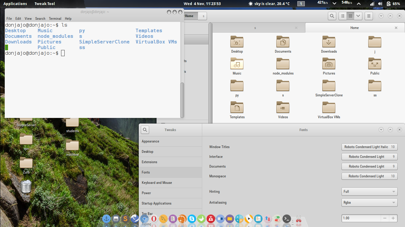 Roboto has a dual nature. It has a mechanical skeleton and the forms are largely geometric. At the same time, the font features friendly and open curves. While some grotesks distort their letterforms to force a rigid rhythm, Roboto doesn’t compromise, allowing letters to be settled into their natural width. This makes for a more natural reading rhythm more commonly found in humanist and serif types.
 - Droid Sans
 Droid Sans was designed with an upright stress, open forms and a neutral, yet friendly appearance. Droid Sans was optimized for user interfaces and to be comfortable for reading on a mobile handset in menus, web browser and other screen text.
 - Inconsolata
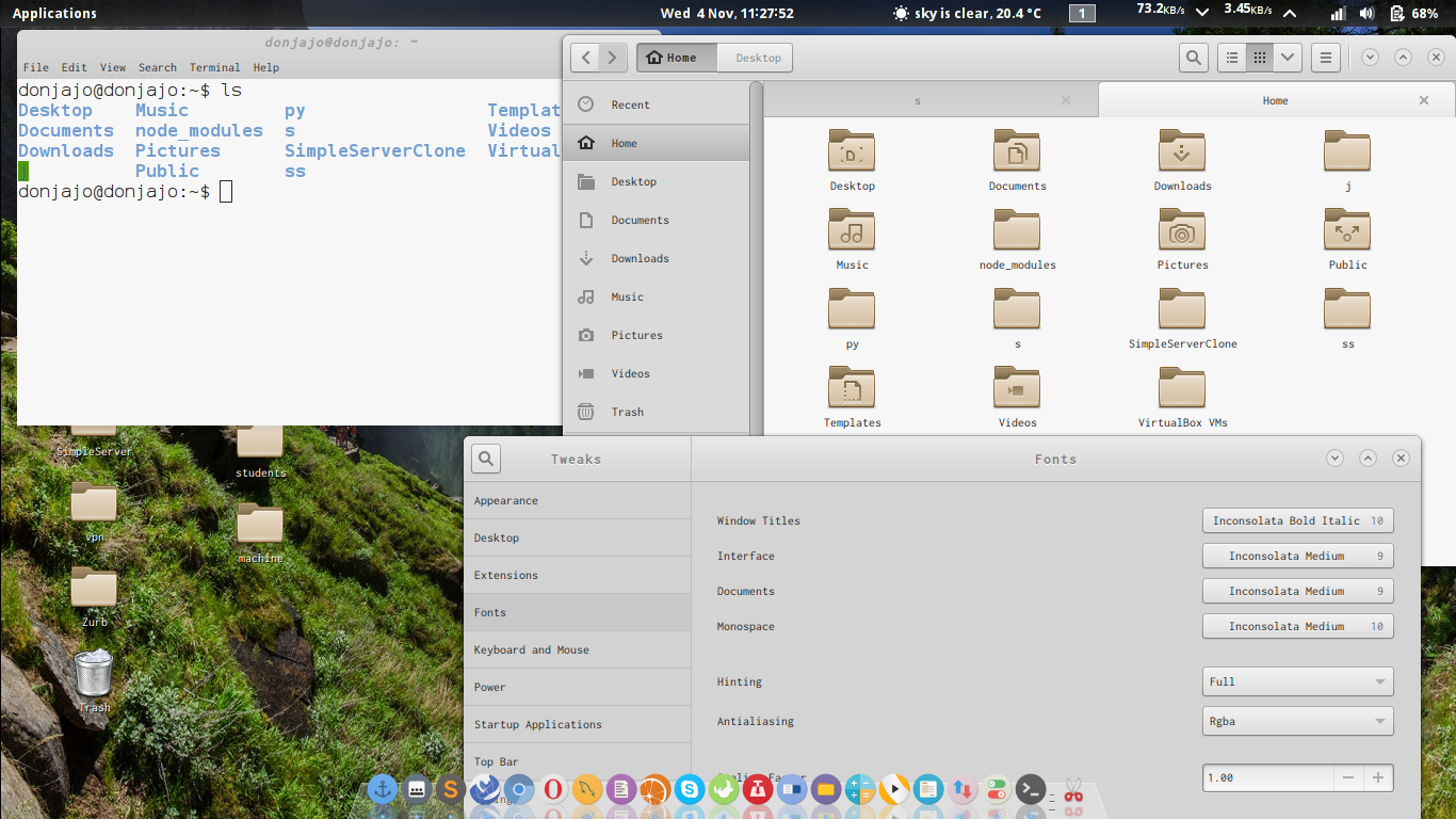 Inconsolata was Raph Levien’s first serious original font release. It is a monospace font, designed for printed code listings and the like. There are a great many “programmer fonts,” designed primarily for use on the screen, but in most cases do not have the attention to detail for high resolution rendering.
These are my 3 best Linux Desktop fonts, hope it helps 🙂
James John
Software Engineer


![[MOBOROBO] ANDROID SUITE FOR PC](https://donjajo.com/wp-content/uploads/2013/06/1_20_06_13_1_52_10-150x150.png)